In any home, new or old, the master bedroom is a special consideration. This is a space where we can retreat away from the world. We might invite someone in, but it’s uniquely our own space. Carving out your own space isn’t always easy or possible. This was especially true for both Jordan and I, since as you know, we first lived together in a basement apartment where we launched JessaKae. But you can (and should!) make the time and effort to carve out a nook of your own.
In our new home, the master bedroom is a place where we can leave challenges of the day-to-day at the door. We don’t have to tackle the big issues out in the world. It’s a space to relax, reflect on our lives together, as well as feel grateful and at peace. Alice Lane Interiors helped us accomplish just that. Almost every other room in the house is a whirlwind of activity with individual demands on us to fulfill our responsibilities as a wife, husband, parent or business owner.
As winter blanketed the valley in our first holiday season, we knew we had to try to find time to end an evening early, start a fire, and appreciate a quiet moment. We have everything we need to relax for a few minutes and enjoy being ourselves, to reconnect and leave (as much as is possible) the business and parenting on pause.
As with all of our home, Shelby Homes played an integral role connecting and coordinating the selection of contractors and products that we used throughout the build.
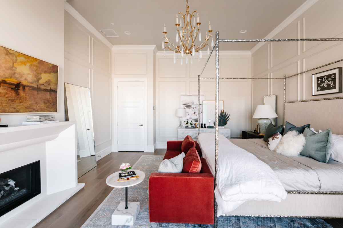
Our master bedroom is bright and follows a timeless, all-white decor. White means different things in different cultures; in Western culture, it often symbolizes purity, innocence, cleanliness and peacefulness. There is a safe simplicity in a white color palette, and white is also traditionally a blank slate. In Feng Shui, white represents the element of metal, which means that wood and glass are exceptionally good-looking partners when used with white. Layering different tones of white allowed us to elevate its look while still providing a “blank slate” foundation to support accent colors and textures.
Everywhere in our room, you can see metal, wood and glass working together to create a balanced canvas of materials. Our walls, painted by Original Painting, LLC using Benjamin Moore “Olympic Mountains” and “Steam” on the trim, are accented with traditional picture frame molding. This style of wall molding can be found in very traditional English and French homes (think 1700’s) and has a timeless power to transform a blank wall into a complex work of craftsmanship. Art can be hung within or across the molding, and we chose to do both! We hung several pieces within the framing and leveraged our dresser as a gallery wall for larger pieces to span across.
The Anderson Tuftex hardwood floors were installed by National Flooring Brokers and look amazing as a neutral layer to build on (use the code JESSA to get a free sample from their site). Their Kensington line was meticulously stained in layers to achieve the perfect tone for layering with any color palette, and the 8-inch planks, with wire-brushed textures, emphasized the traditional, rustic look of the room. We wanted to capitalize on that look — including a fireplace as part of our planning. A fireplace in the bedroom may seem like a no-brainer for some, but we went back and forth on it. Experiencing it in person, we couldn’t be happier with how warm (literally and figuratively) it makes the room.
The traditional touch is offset with the modern. Our canopy bed underscores a traditional look while presenting a sleek, modern texture, and is unadorned to allow maximum views from anywhere in the room. Our mirrors have an infinity or bevelled mirror edge, and our bathroom has a full wall of mirrors reflecting the colors of the valley back into the space. Everything has been arranged with the purpose of feeling bright, safe, at peace and immersed in the natural environment within and without.
To enhance the drama and moodiness of the room (what bedroom would be complete without it?) we had help from Uptown Drapes to install blackout blinds and drapes. We got our furniture and art through Reimagined Home, and coordinated our modern twist on the traditional cut glass knob through the selection available at Emtek. Here is where you can find some of these pieces for your own home:
- Our Canopy Bed
- Floor Mirror
- Nightstand
- Dresser
- Art 1 (above bed)
- Art 2 (dresser)
- Art 3 (dresser)
- Sofa (custom, contact Reimagined Home for ordering)
- End table
- Lamps
- Wings
- Mirrors
- Rug
Sleek elements of glass and metal mixed in with softer and plush textures let us create a well-balanced blend of masculine and feminine in the room. And, of course, a bright room wouldn’t be possible without the floor-to-ceiling windows installed by Sierra Pacific Windows across the entire back wall of the house. The curvature of the window across the master bedroom and bath was not only challenging for the windows themselves but also the trim.
Sometimes the smallest tasks can morph into your worst headache — but we found a super flexible trim to get the job done. It was well-worth breaking out of the traditional square, which has given this space a special touch.
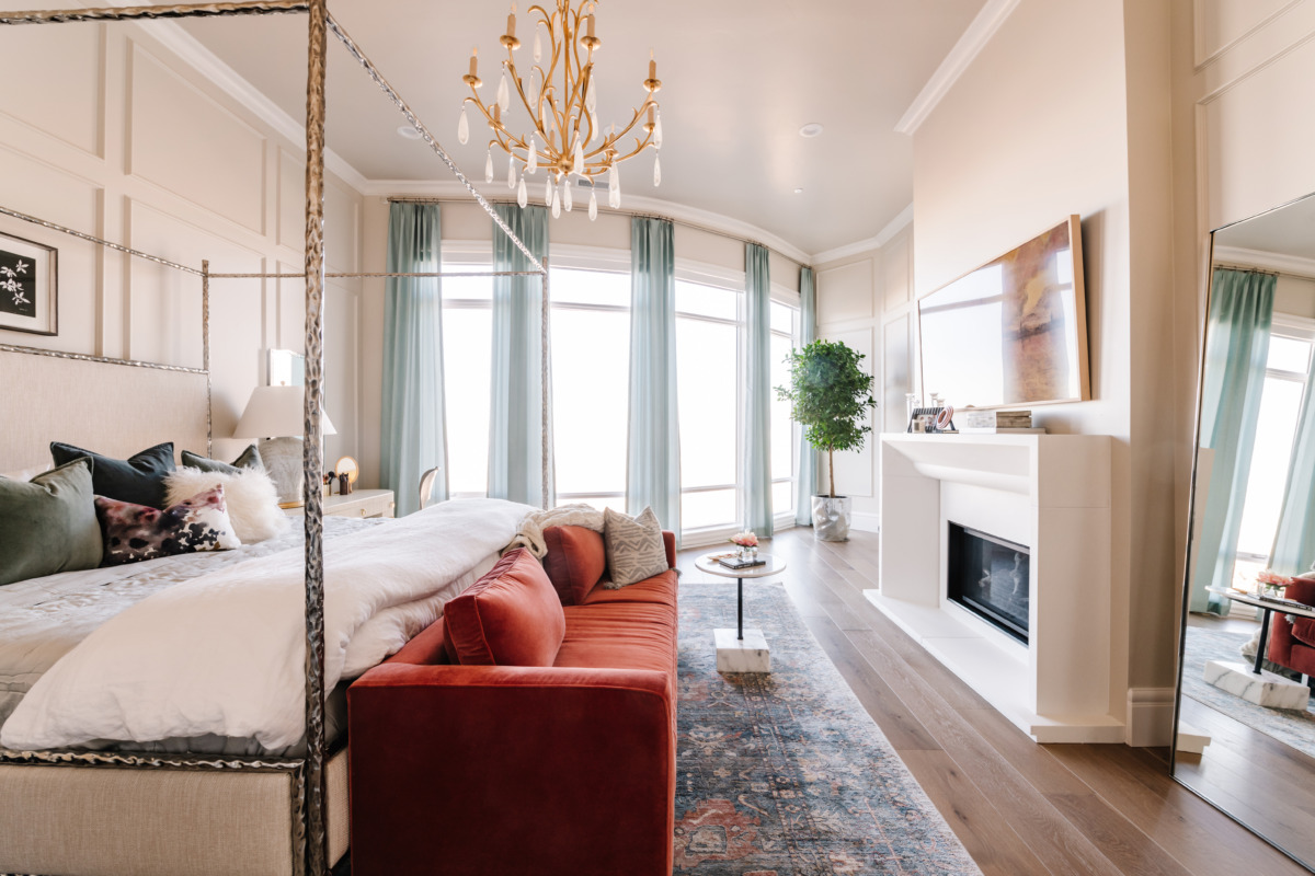
To complete the timeless look of our space, Hudson Valley provided our chandelier, table lamps, and sconces in the bath.
The master bathroom could definitely qualify as the star of the show. Our shower spans the space across our curved fully windowed back wall, letting you take in beautiful views, including a full view of the sunset. The colors are reflected in our tile work, installed by Tule Tile, LLC to add to a feeling of immersion with nature. Many people say their best ideas might happen in the shower, and we’ve designed our shower to be restorative, joyful and meditative all at once.
We wanted to bring as much of the natural view into the room as possible. Part of this included the installation of a full, antique glass wall that stretches wall-to-wall, with a clearer mirror nested and centered above the sink. The mirrors were incredibly fragile and required three separate visits and two months post-moving in to complete the project! It goes to show that some things take longer than anticipated (let’s be real, a lot of things do), but they aren’t any less worth the wait.
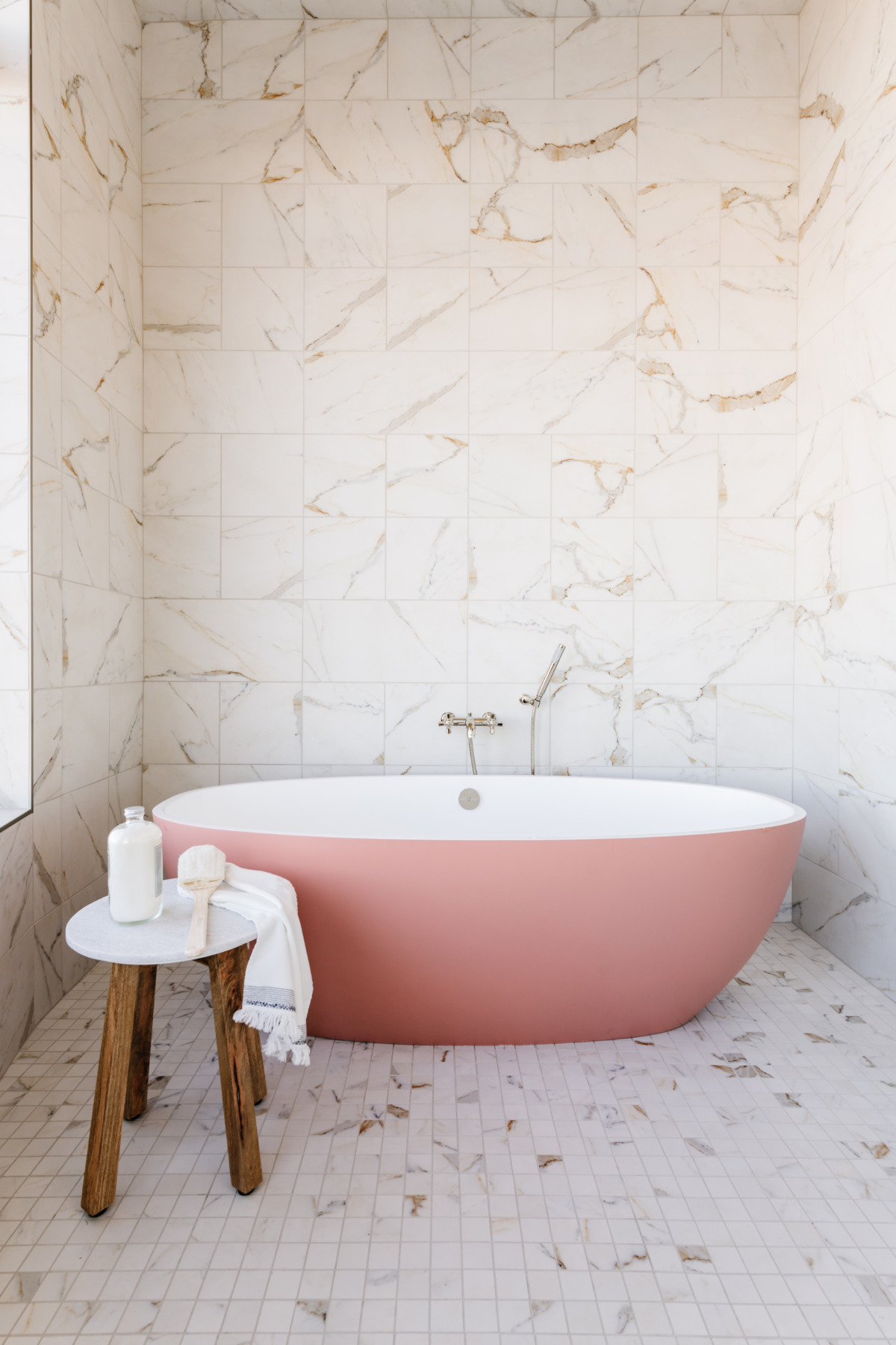
Completing our bathroom is a deep, external tub. The tub and fixtures were all purchased from House of Rohl, and the tiles were all purchased from Bedrosians Tile, which had the ideal marbling to match our views. The tile we used is their Classic 2.0 2×2 tiles, 24×24 and 12×12 in Calacatta Oro.
What do you think of the final touches? What success have you had working with a white color palette and a mix of metal, glass and wood materials? Let me know in the comments!
Photographer: Rebekah Westover
Builder: Shelby Custom Homes
Architect: James Carol
Windows: Sierra Pacific Windows
Designer: Alice Lane Interior Design
Painter: Original Painting, LLC
Decorator: Edit Design House
Flooring: Anderson Tuftex & National Flooring Brokers
Tile: Bedrosians
Hardware: Emtek
Tile Installers: Tule Tile
Window Treatments: Uptown Drapes
Plumbing/Bath: House of Rohl, Victoria & Albert

